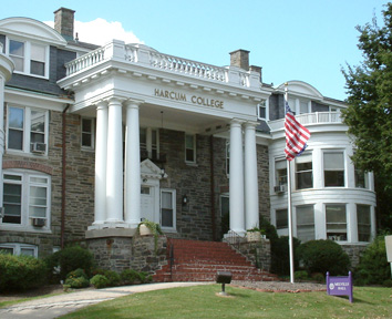
Harcum College
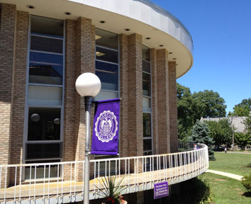
Founded in 1915, Harcum College is the oldest two-year independent residential college in the Philadelphia region. Located in Bryn Mawr, PA it was the first college in the Philadelphia area authorized to grant associates degrees.
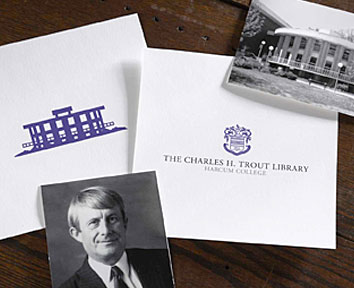
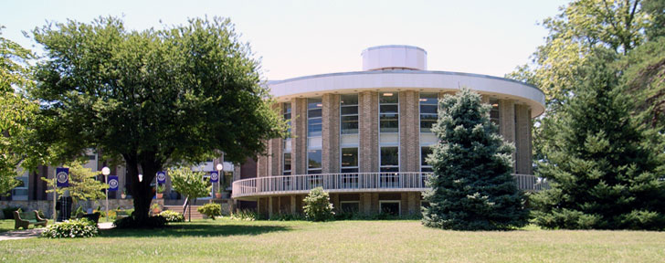
We were approached by Harcum College’s Communications and Marketing team to help them with the creation of a new identity for the school’s library. Harcum was at the end of a fund-raising campaign to renovate and rename the library in memory of one of the most beloved presidents in the history of the school, Dr. Charles H. Trout. The library, a stunning example of mid-century modern architecture, stands as both the physical and emotional center of the school. Its rebirth would be a huge boost for the whole community. It was a big responsibility and we were honored to contribute to Harcum’s one hundred year history.
PROCESS
We got right to work researching the school’s existing branding, Dr. Trout, and the history of the library. This is where the questions started to arise about brand equity. In short, brand equity can be described as how much influence your brand has. Brand equity is created over time, and when done correctly, all of the money invested in your brand is working together to increase brand equity while lowering overall marketing costs and increasing revenue. That’s kind of the whole point of the process.
We had many conversations at the studio about Harcum’s brand equity and how far we could push the library’s identity before we began affecting the larger brand. We decided to pursue two strategic paths as a way to get the conversation started.
- Create an identity that would be part of the Harcum College brand
- Create a unique identity that would compliment the Harcum College brand
This carefully nuanced progression may seem overly cautious but it was necessary to make sure that the existing brand did not get watered down by the new identity.
CRAFT
In the first round of creative development we always build a progression of options to be reviewed; from conservative to “we love it, but we would never use it”. This allows us to be as creative as possible within the project parameters, giving our clients the opportunity to experience a complete exploration of the project. It eliminates a lot of the “what ifs?”.
Once the work began, we quickly determined that the Library’s identity should not be a unique identity. It should fall under Harcum’s existing branding. We presented our range of identity options and used them to explain the benefits of our recommendation. To the credit of the Harcum team they agreed with the strategy, but there was one problem.
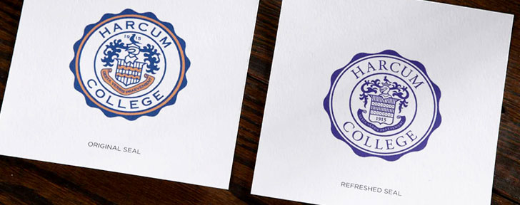
Over a one-hundred year span the existing identity for the college had been updated numerous times without care or attention to the brand’s equity. In recent years it had been neglected to the point where the identity for the college had been distorted. There were several versions of the logo and their school colors were often being reproduced in several different shades. The brand equity had been watered down. We presented the idea to refresh and refocus the College’s branding to not only cover the library but to cover all of the sub-schools and departments within Harcum.
RESTORATION
We proceeded very cautiously. There are a lot of emotions tied to a brand and none more so than a college or university. We knew that a drastic update would be met with anger and outright rejection if not handled carefully. We researched the existing identity and looked back through their archives to find examples of versions from the past. After organizing all of the assets we went about trying to make sense of it all, distilling it down to its most universal elements. Initially we were calling the project a brand “refresh” but soon started calling it a brand “restoration” to remind us how important this project would be for the school.
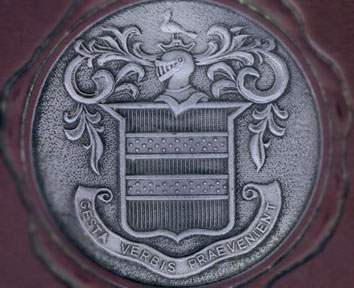
With the help of a yearbook from the 1930s, we had found the reference to restore the existing logo to its former glory. Once we had it redrawn, we corrected any functional limitations, selected a color palette and finalized the typographic choices. We then were able to develop a 3 tiered branding system to cover all future and current applications, including the Charles H. Trout Library at Harcum College.
- The Harcum Crest – The primary logo
- The Harcum Seal – The secondary logo to be used for large applications and merchandise
- The Harcum Branding System – To be used to designate any group, department or partner
The new identity system was so well received that we were asked to present it to the whole staff at their annual launch meeting. It was very gratifying to see the enthusiasm for the identity and how much it meant to the people who matter most. In the months that followed it has been enthusiastically implemented across the school. With a solid foundation in place, Harcum can now start building back the brand equity that was lost.
EXECUTION
The following is a list of work we have completed for Harcum College:
- Harcum College identity
- Charles H. Trout Library identity
- Harcum College Centennial identity
CONTACT
If you have a project you would like to discuss, a questions about our services or would just like to chat about branding, please don’t hesitate to get in touch. We would love to hear from you.